Style hyperlinks as buttons with solid colour or transparent backgrounds.
Apply soft corners and rounded edges to hyperlinks styled as buttons.
Add Font Awesome icons to your web pages.
You can view finished versions of the two sample web pages you will update with hyperlinks in this Tutorial by clicking the links below. The finished samples will each open in a new tab of your web browser.
Links can be styled to look like 'click/tap me' buttons. Such links are styled differently to links within paragraphs of text.
They do not have underlines.
They have padding all around them to create the button appearance.
They have bottom margins to push down whatever content follows them, and often top, left and right margins too.
They have borders and, typically, background colours too.
Their corners can be square, rounded or semi-circular.
Their CSS class names typically begin with btn. For example, btn-solid, btn-rounded or btn-ghost.
Adding a hyperlink button to your sample web page
In this section you will add a button-styled hyperlink to the page-11.html sample web page in your websites folder.
In VS Code, open the page-11.html web page and style-11.css stylesheet.
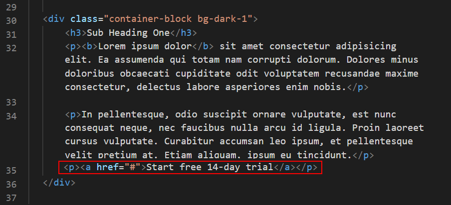
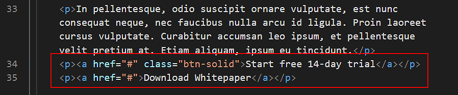
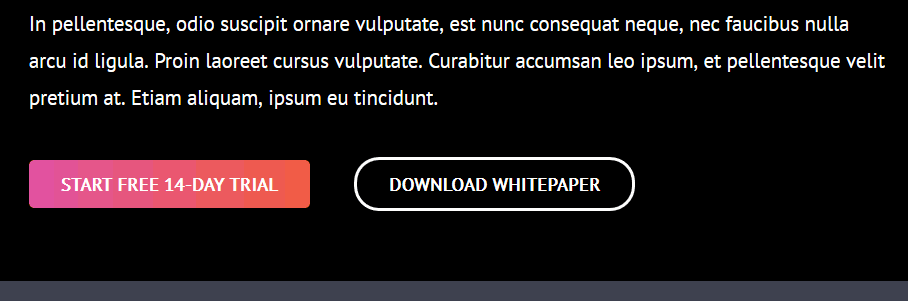
In the page-11.html file, after the introduction, and at the end of the second paragraph in the first section, add the following new paragraph which contains a hyperlink.
<p><ahref="#">Start free 14-day trial</a></p>
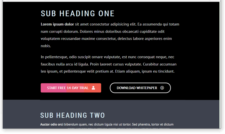
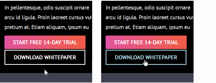
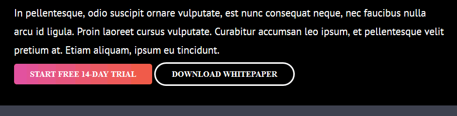
Your web page should now look as shown below.
Next, add a class with the name of btn-solid to the hyperlink.
You can see that the text inside the two buttons has now ‘lost’ some of their properties. Specifically:
font-family:: The text is now displaying in the web browser default font of serif.
font-size:: The text is now displaying in the web browser default size of 16px.
Here is what has happened:
When a hyperlink button is inside a pair of opening <p> and closing </p> paragraph tags, it inherits or ‘picks up’ the font-family and font-size styles of the paragraph that encloses it.
When the enclosing paragraph tags are removed, the two hyperlink buttons have no font-family and font-size styles to inherit. So their text reverts back to the web browser’s default values.
The solution is to apply font-family and font-size styles directly to the hyperlink buttons.
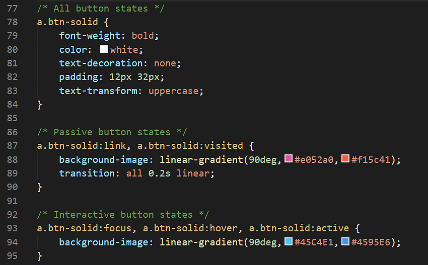
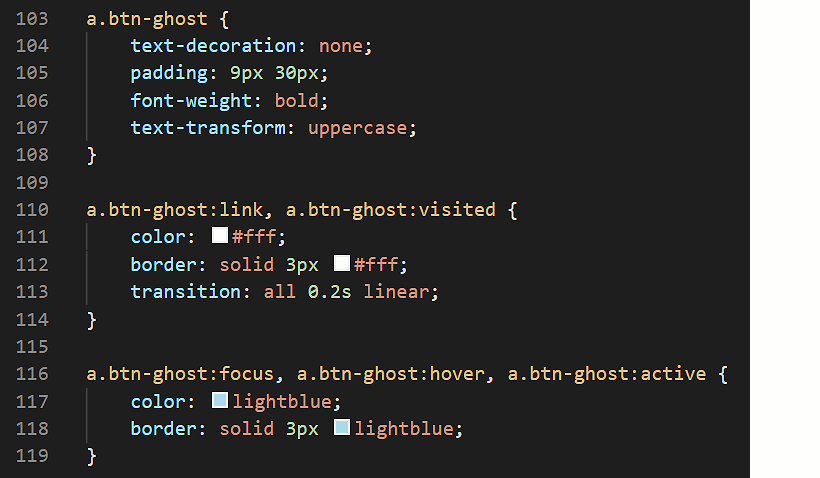
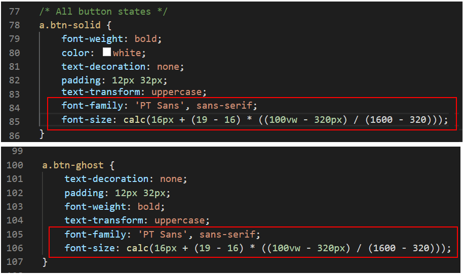
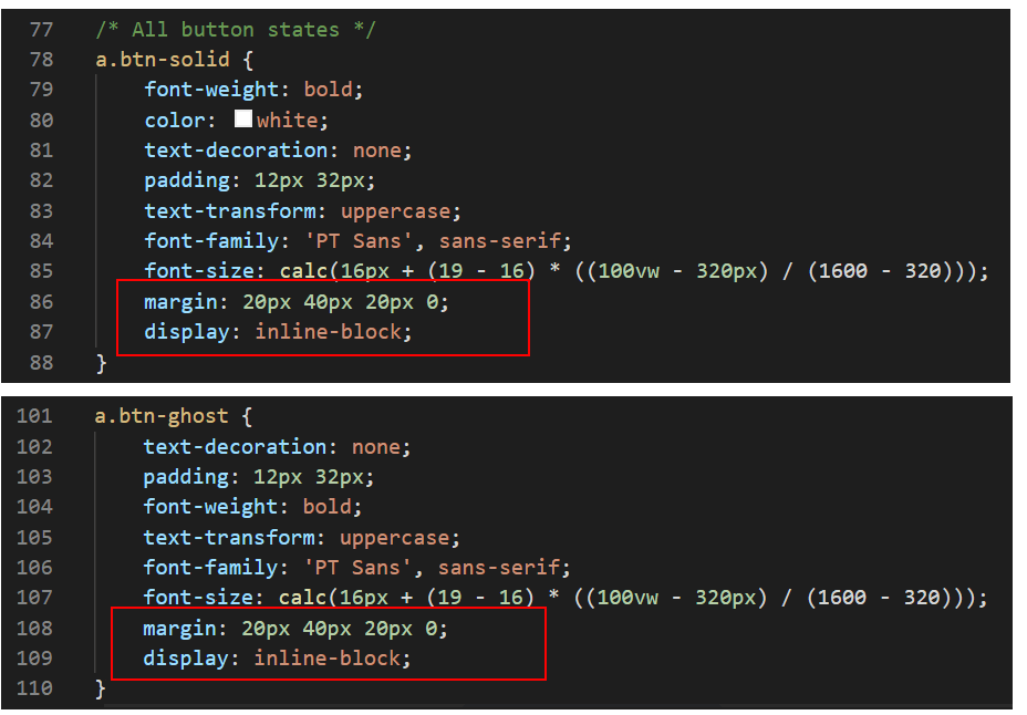
In the style-11.css stylesheet, add the following two property and value pairs to the first, all states set of style rules for each of your two button selectors, .btn-solid and .btn-ghost.
The complete ‘all states’ style rules for the two hyperlink button selectors should now look similar to the following.
Note that the fluid font size of the text inside the buttons is slightly smaller than the fluid font size of the text paragraphs in the rest of the web page.
Save your style-11.css stylesheet and view your web page.
Your two hyperlink buttons now have their own CSS properties of font-family and font-size set just for them.
They no longer depend on inheriting these properties from enclosing paragraph <p> ... </p> tags.
Positioning buttons with inline-block
You will want to add some margin spacing around your hyperlink buttons. These margins will:
Add spacing between the hyperlink buttons and any other elements on the web page, such as text or images.
When two or more buttons are placed together, the margins will add some spacing between adjoining buttons.
Here are the steps:
In the style-11.css stylesheet, add the following margin styles to the first, all states set of style rules for each of your two button selectors, .btn-solid and .btn-ghost.
margin: 20px 40px 20px 0;
This should add a top and bottom margin of 20px to each button, and a right margin of 40px.
Save your style-11.css stylesheet and view your web page.
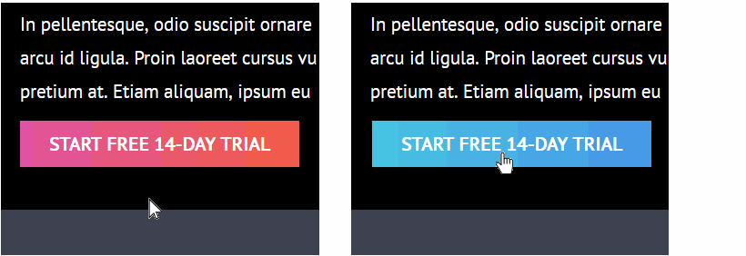
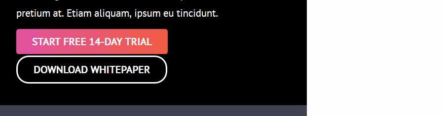
As you can see, there is now a margin-right of 40px applied to two buttons. This is what you want.
But your web browser ignores your margin-top and margin-bottom values of 20px.
Here are the steps to correct this:
In the style-11.css stylesheet, add the following property and value pair to the first, all states set of style rules for each of your two button selectors, .btn-solid and .btn-ghost.
display: inline-block;
The complete ‘all states’ style rules for the two hyperlink button selectors should now look similar to the following.
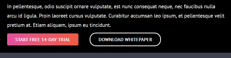
Save your style-11.css stylesheet and view your web page.
Success! Your hyperlink buttons are now complete.
Click page-11.html to view a finished sample of this web page in a new tab of your web browser.
Adding icons with Font Awesome
In the final part of this Tutorial, you will add some icons from Font Awesome to your button-styled hyperlinks.
In VS Code, display your page-11.html file.
In the head section of the web page, just before the closing </head> tag, copy-and-paste the following comment line and code.
<!-- Link to icons for Font Awesome 5 -->
<linkhref="https://cdnjs.cloudflare.com/ajax/libs/font-awesome/5.14.0/css/all.min.css"rel="stylesheet"integrity="sha512-1PKOgIY59xJ8Co8+NE6FZ+LOAZKjy+KY8iq0G4B3CyeY6wYHN3yt9PW0XpSriVlkMXe40PTKnXrLnZ9+fkDaog=="crossorigin="anonymous">
This adds the Font Awesome stylesheet to your web page.
Click the option named Icons in the menu bar across the top of the screen.
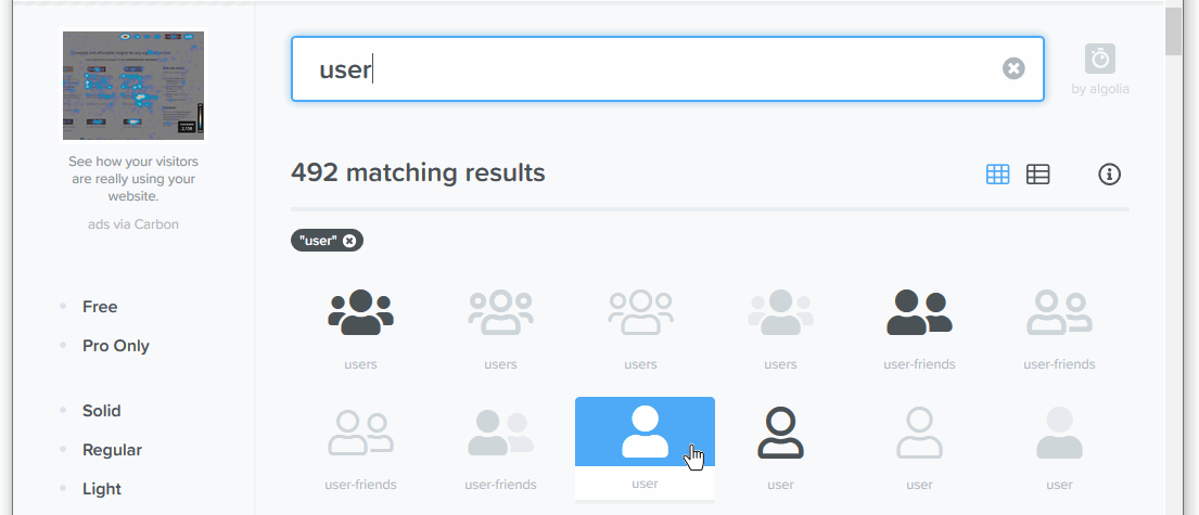
On the next page displayed you can use the Search box to locate icons by name from the Font Awesome range of 1535-plus free icons.
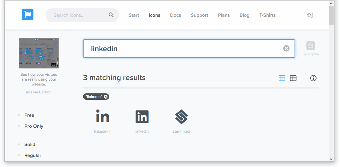
For example in the Search box, enter the word:
user
and click the result displayed below.
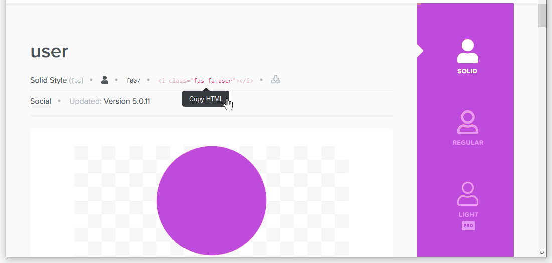
On the next screen displayed, you can see the HTML code to generate the 'user' icon.
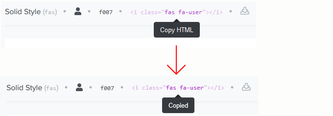
Just click once on the code to copy it.
The HTML icon code will look as follows.
You can now copy-and-paste this or other selected icons to your web pages.
In your page-11.html web page, locate the first of the two hyperlink buttons.
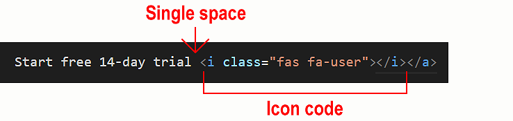
Click after the ‘Start free 14-day trial’ text, press the Spacebar key once and then paste the HTML code you copied from Font Awesome.
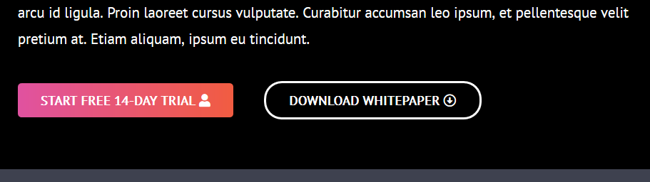
Save and view your page-11.html. The first of your two button-styled hyperlinks should look similar to the following.
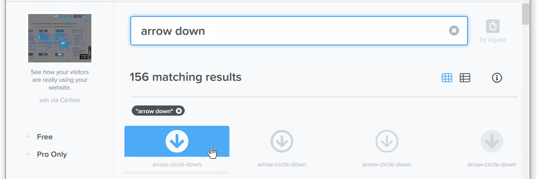
Next, return to Font Awesome, and search for the following icon:
arrow down
From the list of search results displayed, scroll down to the icon named arrow-circle-down.
Click the icon.
On the next screen displayed, click the HTML code to copy it.
In your page-11.html web page, locate the second of the two hyperlink buttons.
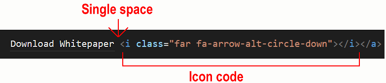
Click after the ‘Download Whitepaper’ text, press the Spacebar key once and then paste the HTML code you copied from Font Awesome.
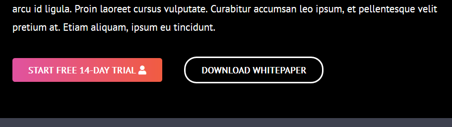
Save and view your page-11.html. The first of your two button-styled hyperlinks should look similar to the following.
You have now successfully added Font Awesome icons to two of your button-styled hyperlinks.
Adding spacing to icons in your buttons
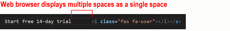
Within your hyperlink buttons, the single space between the text and the icons, created by pressing the Spacebar key once, is not enough. More spacing is needed.
You could type several spaces simply by pressing the Spacebar multiple times. But the web browser will combine multiple empty spaces into a single space. So that is not a solution.
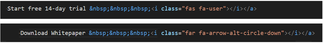
One option is to type the special HTML code that forces an empty space. This is the non-breaking space character. You type this as follows:
For example, in your page-11.html file, you could type three non-breaking space codes inside your buttons as shown below.
Inside each button, between the text and icon, you have four spaces. One space is the result of pressing the Spacebar; the other three are created by the three codes.
Your buttons will now display as follows in your web browser.
The result will look as follows.
Unfortunately, adding lots of codes to text can cause problems when your web page is displayed on mobile-sized screens.
The better solution is to use CSS to add a margin-left spacing value to your icons. Here are the steps.
In your page-11.html web page, remove any codes you may have added inside your hyperlink buttons.
You can leave the single, blank space you typed by pressing the Spacebar key.
Switch to your style-11.css stylesheet, and copy-and-paste the following after all your other button styles.
a.btn-solid i, a.btn-ghost i {
    margin-left: 12px;
}
Save your web page and stylesheet.
That’s it. You have now successfully added spacing to icons within your button-styled hyperlinks.
Click page-11.html to view a finished sample of this web page in a new tab of your web browser.
Uploading your files to GitHub
Upload the following web page and stylesheet to your account on GitHub:
page-11.html style-11.css
Your web page will be published at web addresses similar to the following:
https://username.github.io/page-11.html
It may take a few minutes for your uploaded files to appear on GitHub.
 Note that the fluid font size of the text inside the buttons is slightly smaller than the fluid font size of the text paragraphs in the rest of the web page.
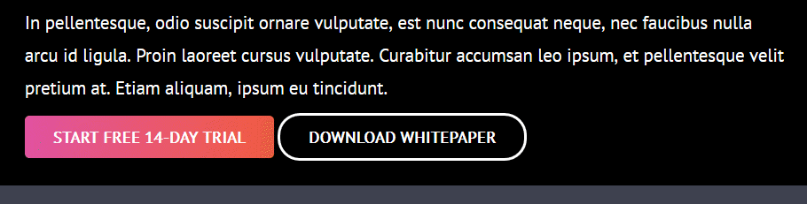
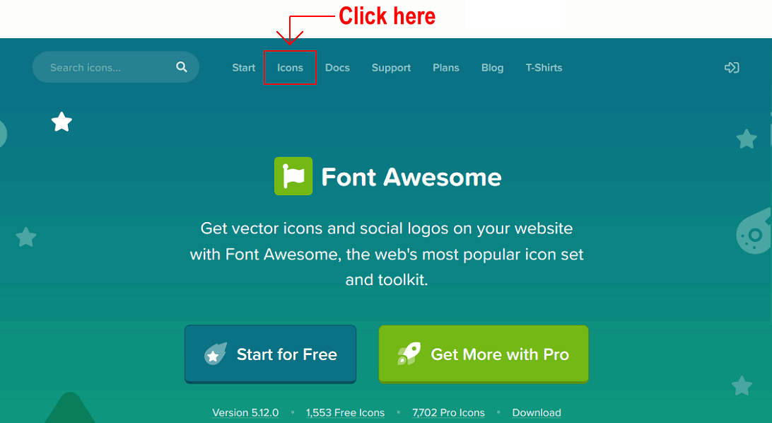 On the next page displayed you can use the Search box to locate icons by name from the Font Awesome range of 1535-plus free icons.
 Just click once on the code to copy it.
 The HTML icon code will look as follows.
 Click the icon.
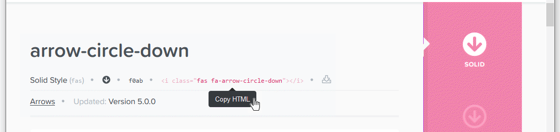